Client
N-Glamping
N + Glomour + Camping = N-Glamping !
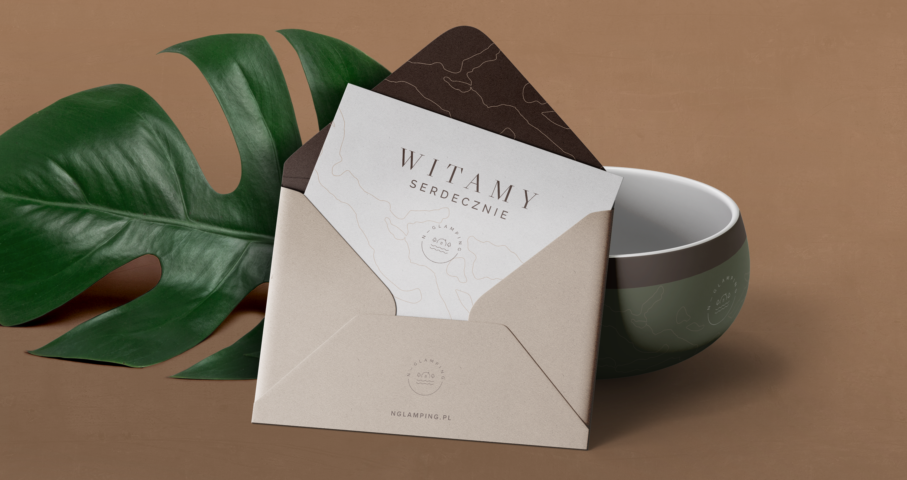
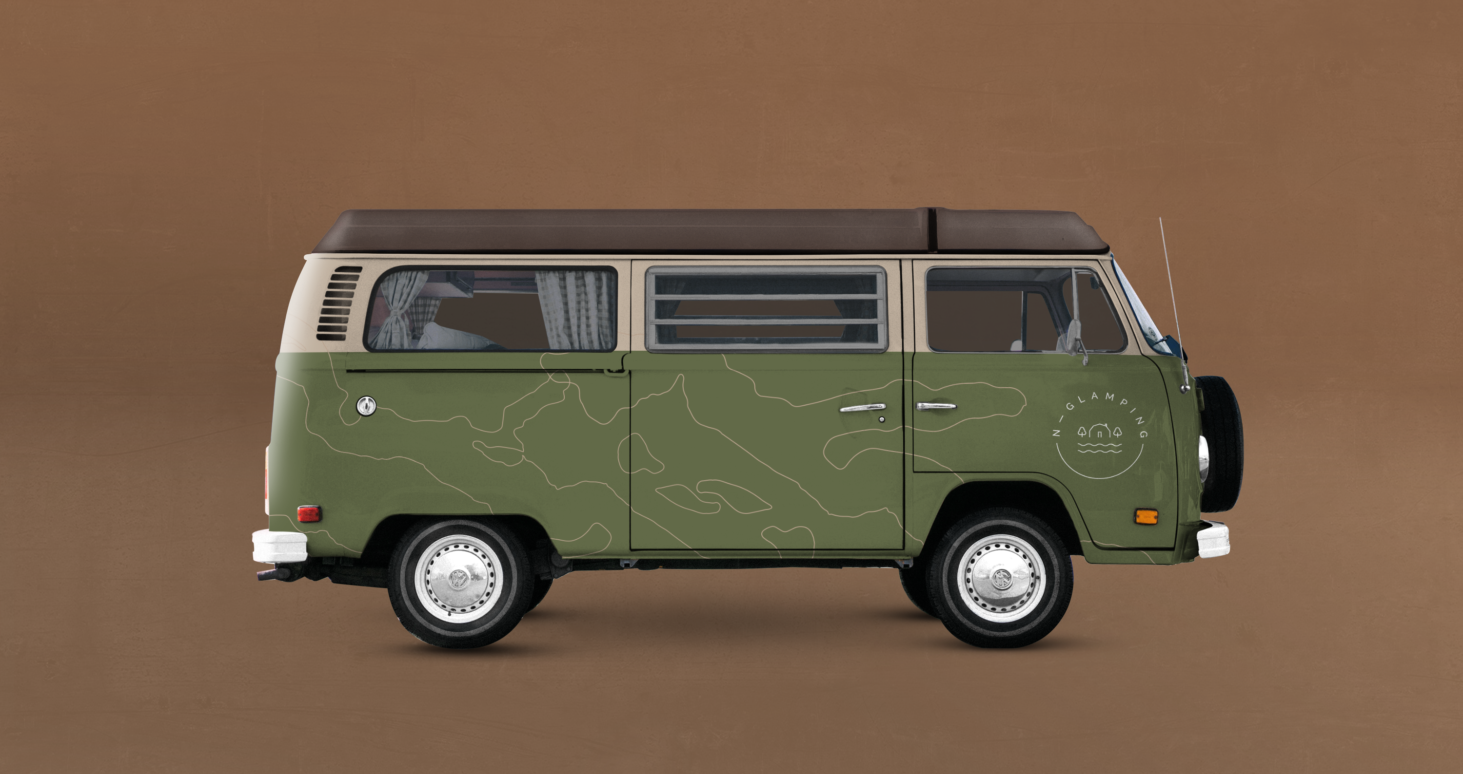
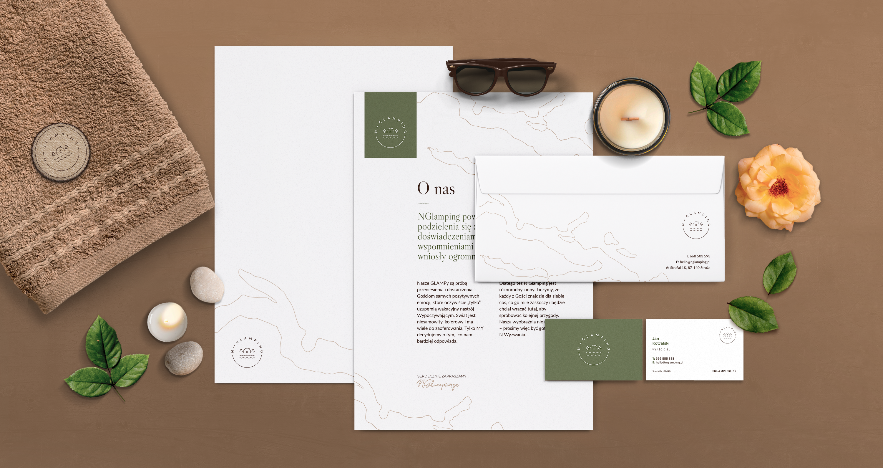
The owners of N-Glamping came to us for help in creating a visual identity for glamping (Glamor and Camping). The basis for building the identification is the logotype, which was supposed to be light and minimalistic and easy to use on a wide range of products. The internal element of the logotype refers to the unique shape of glamps. The whole shape resembles the shape of passport stamps that are associated with travel.

WWW
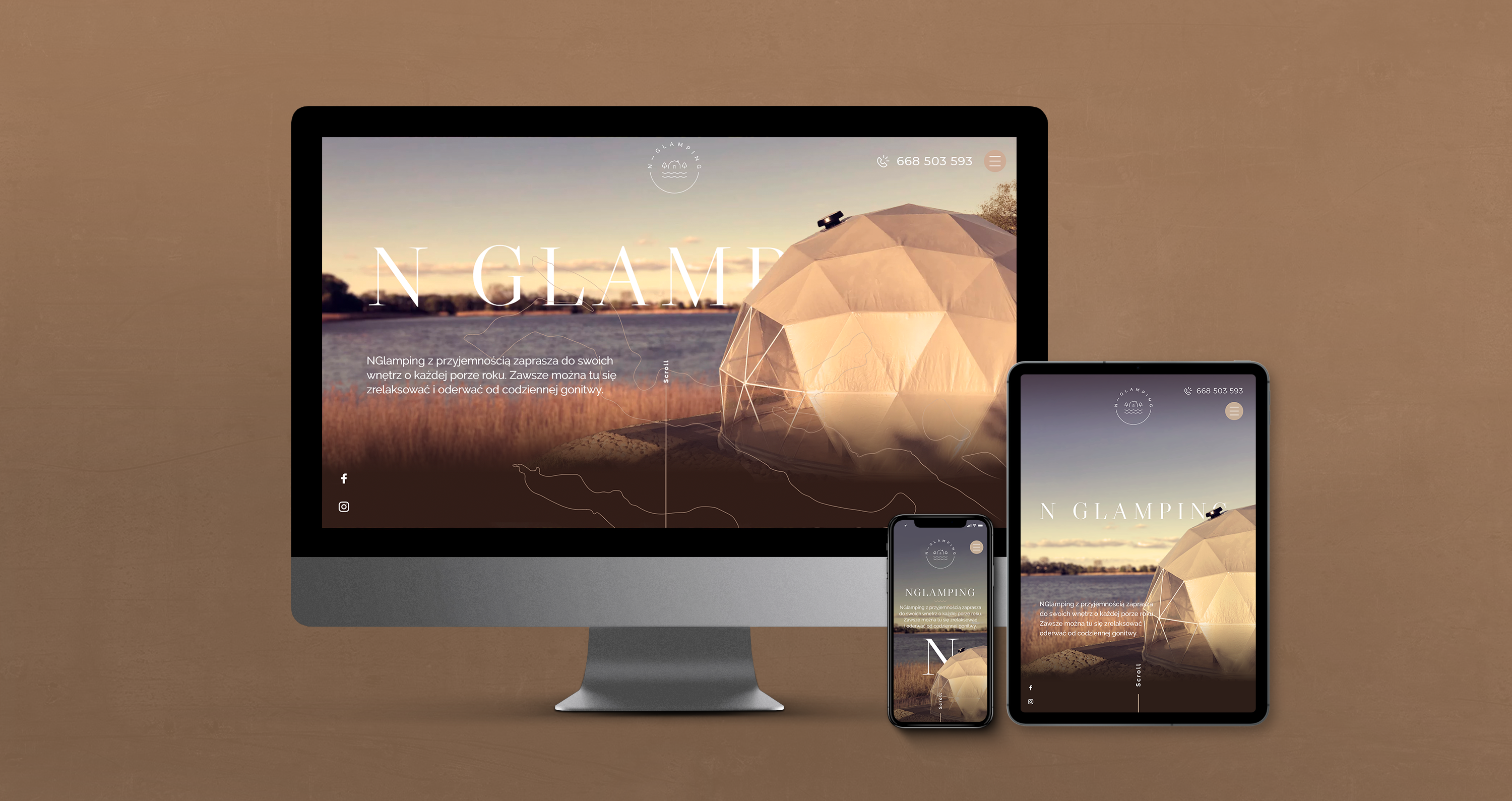
The key assumption for the website was to provide basic information in a clear and attractive way. The task was easier thanks to the extremely picturesque location and the vicinity of Chełmżyński Lake. We used a multi-layered parallax that gives the site dynamism. Our IT department made sure that the website, despite many animated graphic elements, fared well in the google score tests
Merchendise
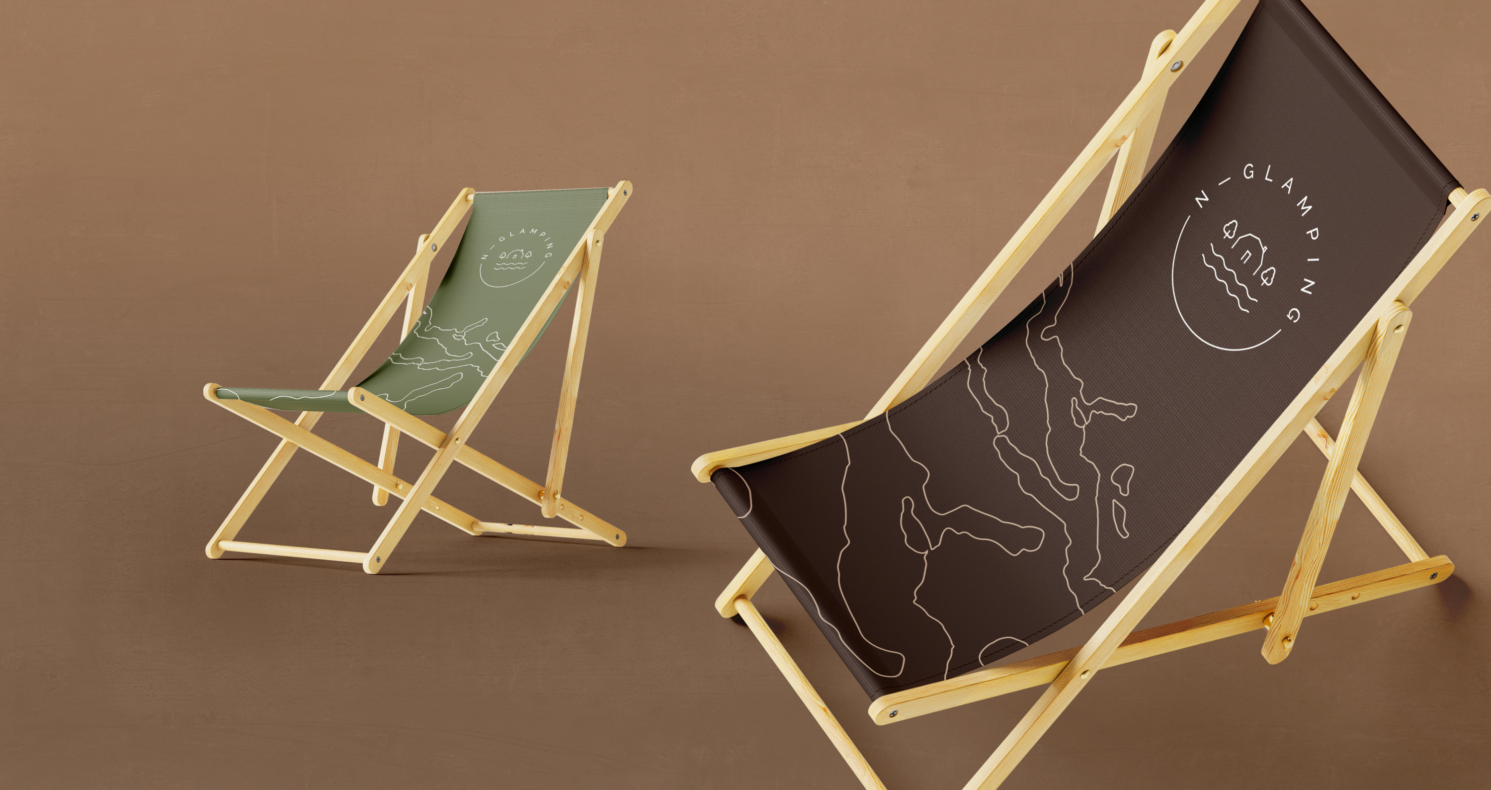
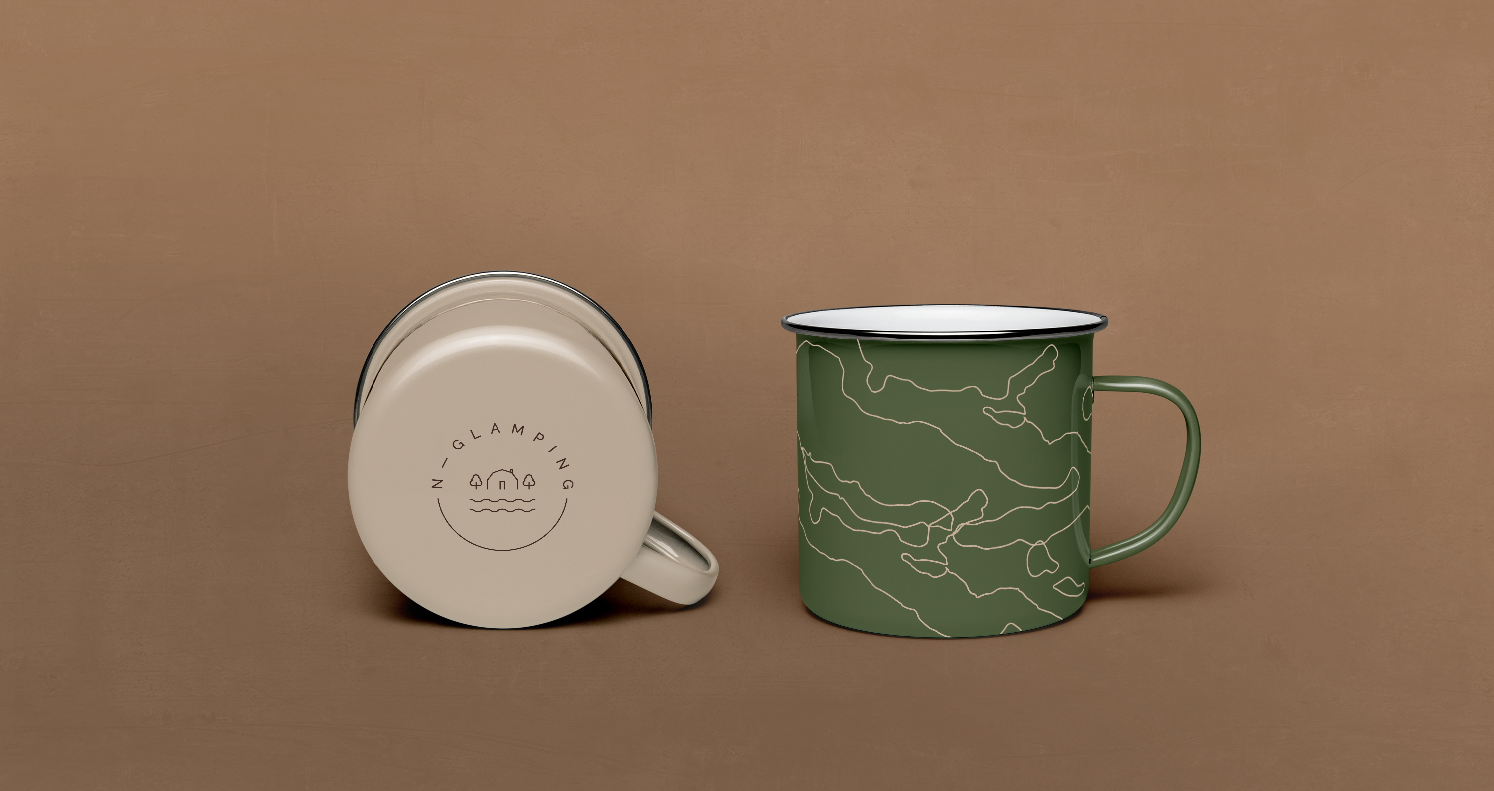
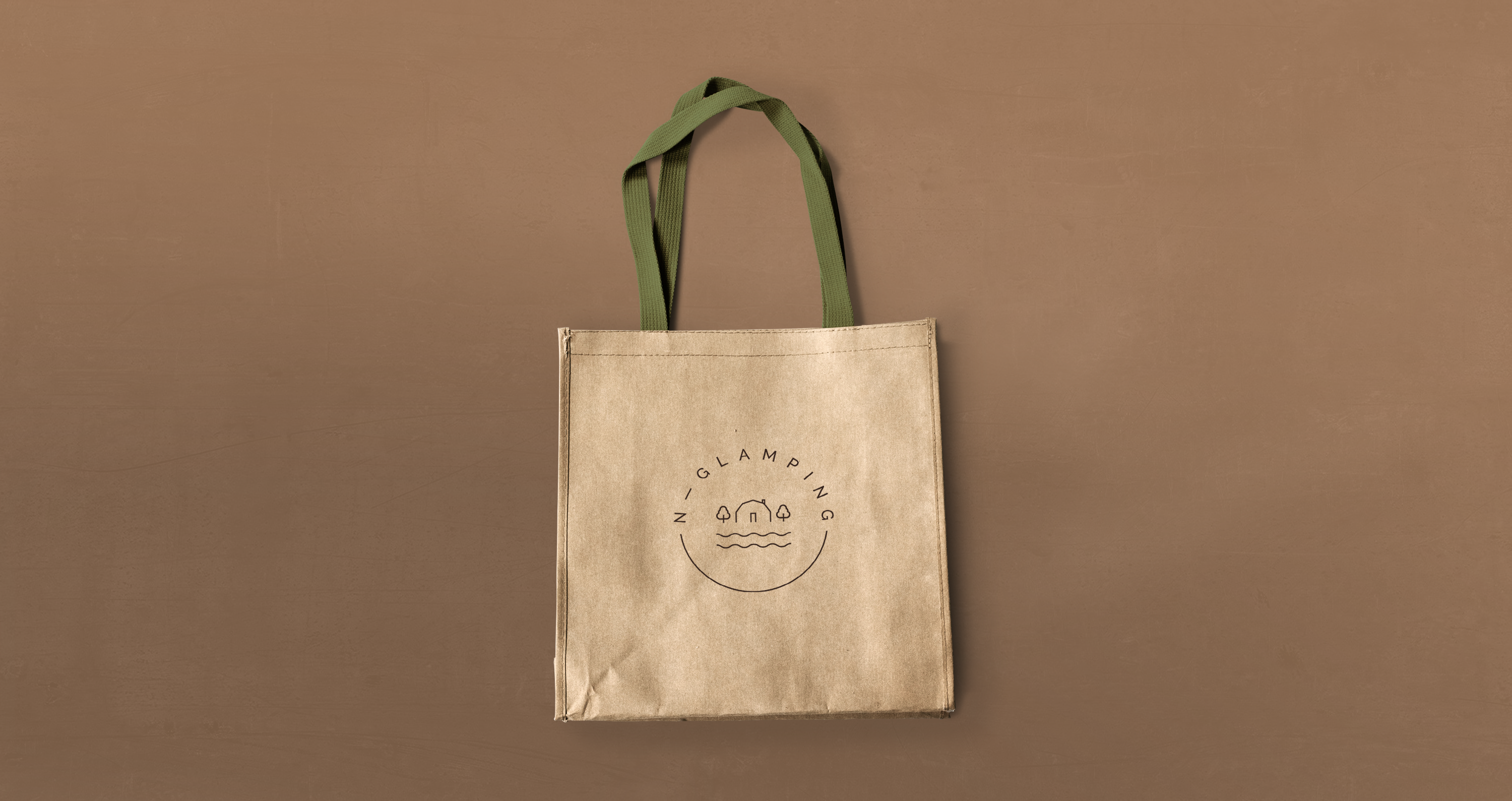
By the way, we had the opportunity to design many identification elements that can be used on the campsite, such as:
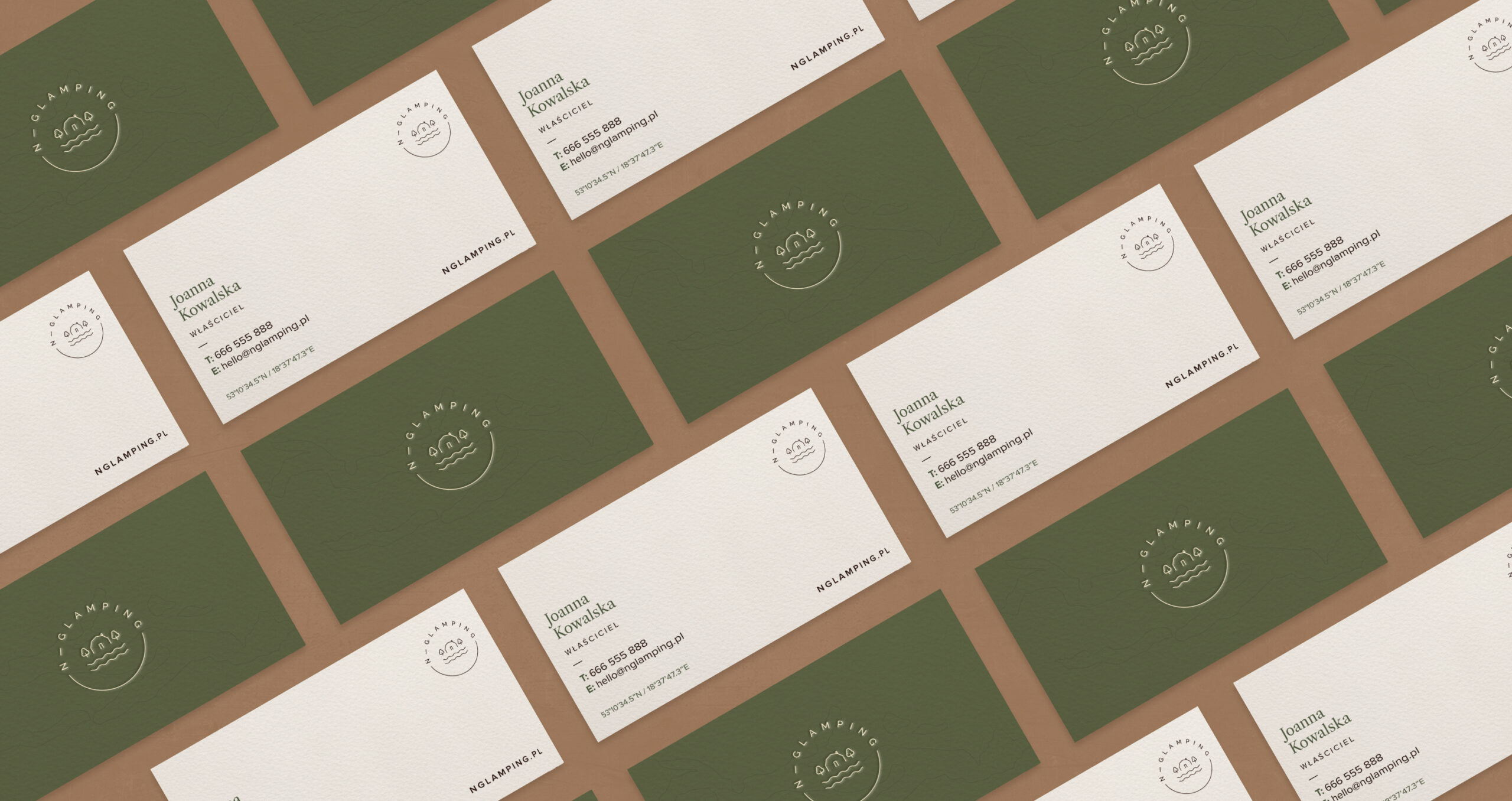
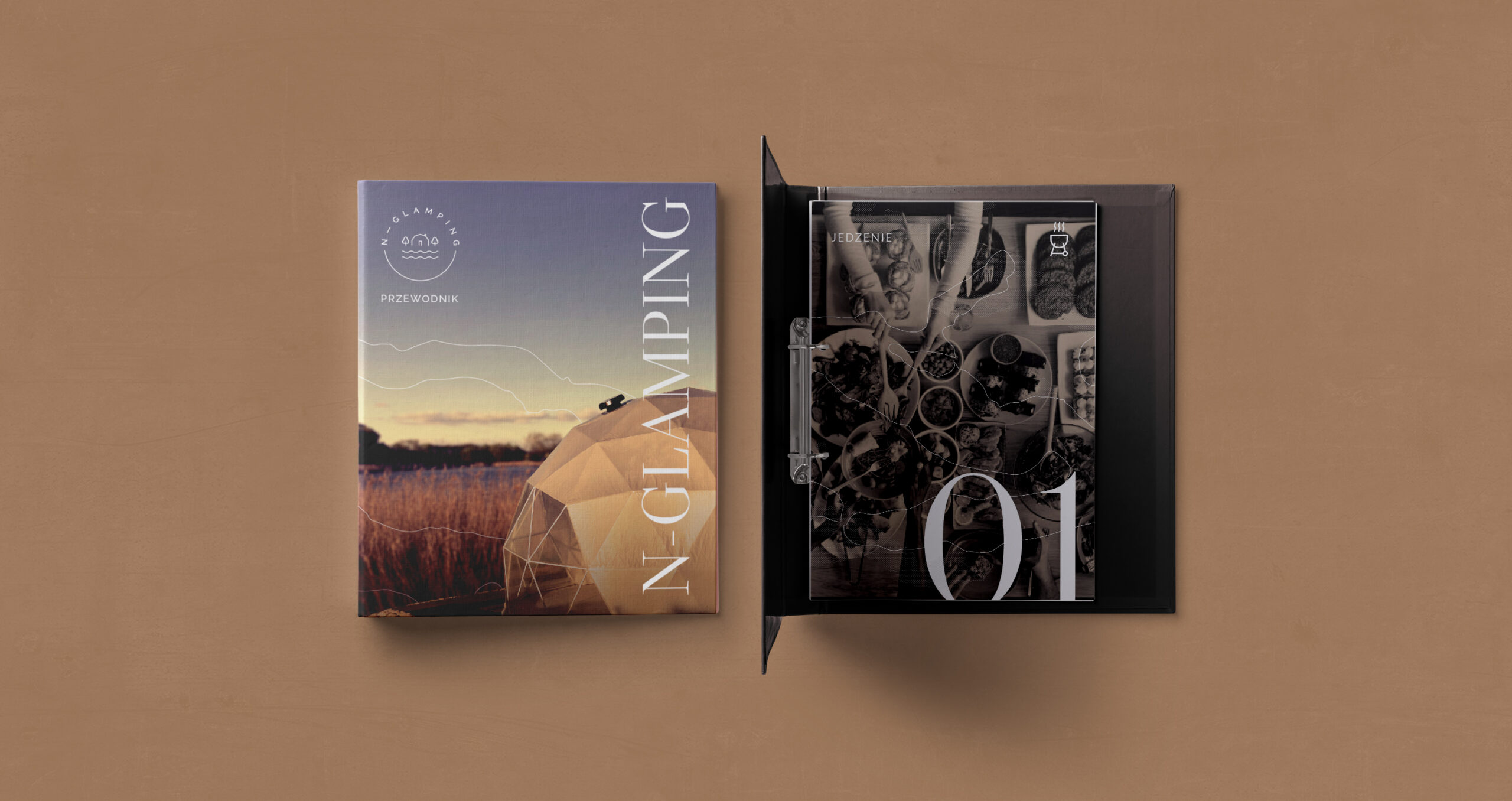
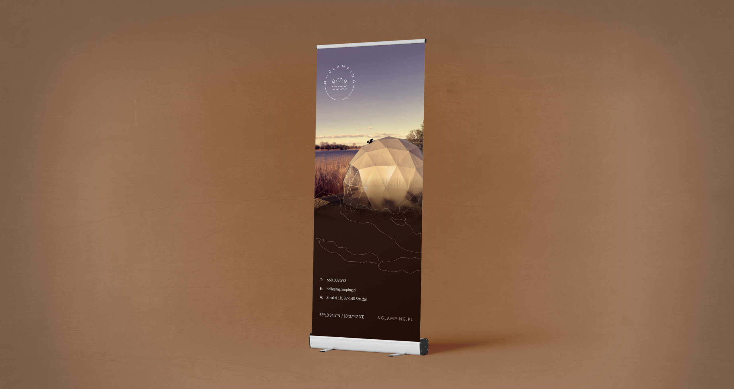
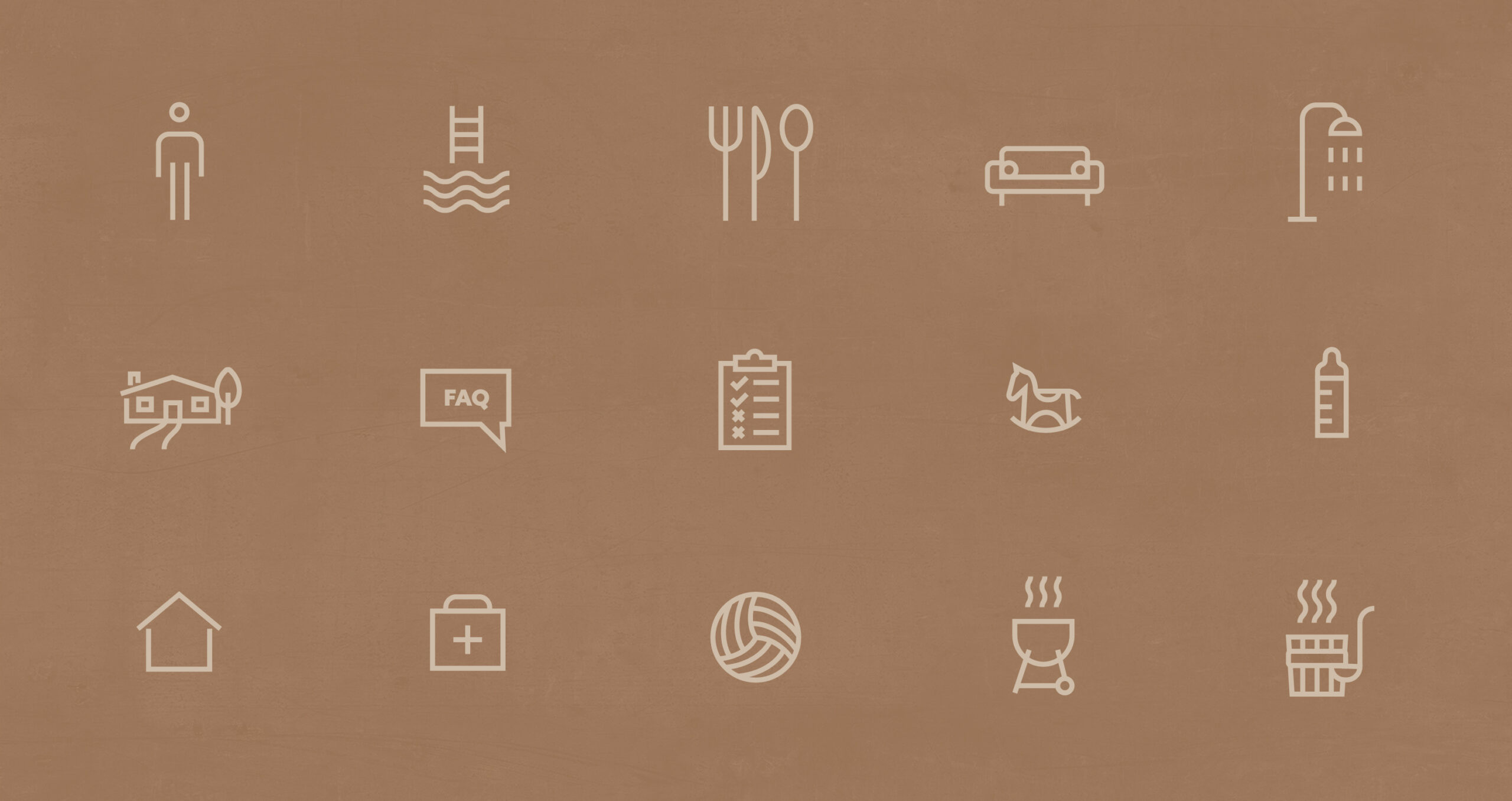
Greeting envelope | Sun loungers | Roll-ups | Catalog | Promotional bag | Promotional mug | Individually prepared Icons | Business cards
